Bento Grid Layout Examples for Responsive Web Design
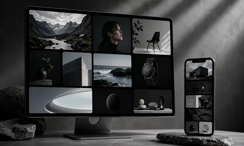
The world of user interface design moves in distinct cycles, shifting from the hyper-skeuomorphism of the early mobile era to the ultra-flat, sterile layouts that followed. In 2026, the prevailing aesthetic strikes a perfect balance: the Bento Grid. Named after the traditional Japanese lunchbox that compartmentalizes different foods into neat, separate boxes, this layout style organizes content into a cohesive grid of asymmetrical, rounded rectangles.
Pioneered heavily by Apple’s product landing pages and popularized by sleek SaaS platforms and developer portfolios, the Bento Grid has taken the web by storm. But this trend is far more than just a passing visual fad for design-forward tech companies. Beyond its sleek, minimalist aesthetic, the Bento Grid is a highly functional, content-first design pattern that solves complex responsive layout challenges when executed with technical precision. It allows developers to present high information density without overwhelming the user.
The Anatomy of a Successful
… READ MORE