Inclusive Design Patterns for High Contrast Dark Mode

Dark mode is frequently treated as a trendy aesthetic preference, a sleek marketing asset, or a useful layout option to save mobile battery life. However, for millions of users worldwide, a dark interface is not an aesthetic luxury; it is a functional necessity. Individuals with specific visual or neurological conditions—such as severe photophobia (extreme light sensitivity), cataracts, ocular albinism, or traumatic brain injuries—experience physical pain, blurred vision, or immediate cognitive fatigue when navigating traditional bright interfaces.

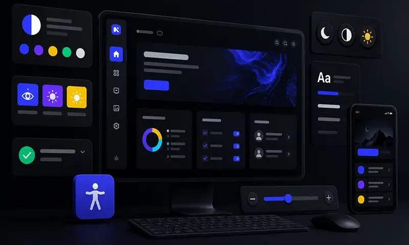
Unfortunately, many standard dark themes fail foundational web accessibility compliance. Simply swapping a white canvas for a dark one often introduces muddy contrast levels, vibrating neon accents, or a complete loss of structural layout hierarchy when shadows disappear. Building an inclusive dark mode requires implementing adaptive, high-contrast design patterns that blend Web Content Accessibility Guidelines (WCAG) AAA compliance with modern CSS token architectures, ensuring interfaces remain highly readable and comfortable for all users.

The

READ MORE
Organic Anti-Grid Layouts for Creative Brand Websites

The modern web has become structurally monotonous. Walk through the digital storefronts of luxury fashion houses, independent design studios, and enterprise SaaS platforms, and you will encounter the same predictable architecture: rigid geometric boxes, symmetrical card modules, and uniform container widths. The massive dominance of standard responsive frameworks has commoditized layout design, reducing the vibrant canvas of the browser into a series of predictable templates. While this homogenization offers predictable patterns for information retrieval, it strips creative brands of their unique personality.

To stand out in a crowded digital landscape, forward-thinking brands are shifting toward organic, anti-grid layouts. By embracing asymmetrical structures, layered fluid depths, overlapping typography, and curvilinear motion paths, designers can break free from traditional container boundaries. When executed correctly, anti-grid web design allows creative brands to cultivate a distinct visual identity and evoke deep emotional resonance, transforming a standard digital store or portfolio into an immersive, … READ MORE

Lightweight Kinetic Typography and Scroll Storytelling Techniques

The modern web has evolved from a static repository of documents into a dynamic, narrative medium. Today, leading brands and creative agencies leverage “scrollytelling”—the integration of scroll-driven animations and kinetic typography—to capture user attention, communicate brand values, and guide users through immersive digital stories. When text bends, shifts shape, or scales fluidly in response to physical interaction, it transforms standard copy into a powerful vector for emotional engagement.

However, this creative freedom often creates an engineering crisis. Traditional scrollytelling sites are notorious performance hazards, relying on heavy external JavaScript libraries that hijack native mouse wheel operations (“scroll-jacking”). These frameworks flood the main main browser thread, causing severe frame-rate drops (jank), battery drain, and poor mobile accessibility.

Combining kinetic typography with scroll storytelling does not require sacrificing page speed. By leveraging modern browser APIs and native CSS layout primitives, developers can build breathtaking, fluid motion designs that maintain a flawless, hardware-accelerated … READ MORE

Technical Mono and Code Brutalism Web Design Aesthetic

Walk across the modern internet, and you will experience a profound sense of digital déjà vu. Driven by the homogenization of uniform utility frameworks, predictable landing page templates, and safe, focus-grouped corporate design systems, millions of web applications look identical. Soft blue gradients, generic rounded corners, pill-shaped buttons, and vast expanses of empty space dominate the landscape. It is an aesthetic built to avoid offending anyone—but it also fails to excite anyone.

In response to this corporate saturation, a rebellious counter-cultural design movement is sweeping through developer utilities, Web3 infrastructures, indie hacker repositories, and cutting-edge design agencies in 2026. This aesthetic rejects polished artificiality in favor of a raw, uncompromising architectural style: Technical Monospaced Typography paired with Code Brutalism. Far from being an accidental or unfinished mistake, this design philosophy represents an intentional, anti-decorative statement that celebrates engineering truth, structural transparency, and high-performance digital minimalism.

Defining the Pillars of

READ MORE
Bento Grid Layout Examples for Responsive Web Design

The world of user interface design moves in distinct cycles, shifting from the hyper-skeuomorphism of the early mobile era to the ultra-flat, sterile layouts that followed. In 2026, the prevailing aesthetic strikes a perfect balance: the Bento Grid. Named after the traditional Japanese lunchbox that compartmentalizes different foods into neat, separate boxes, this layout style organizes content into a cohesive grid of asymmetrical, rounded rectangles.

Pioneered heavily by Apple’s product landing pages and popularized by sleek SaaS platforms and developer portfolios, the Bento Grid has taken the web by storm. But this trend is far more than just a passing visual fad for design-forward tech companies. Beyond its sleek, minimalist aesthetic, the Bento Grid is a highly functional, content-first design pattern that solves complex responsive layout challenges when executed with technical precision. It allows developers to present high information density without overwhelming the user.

The Anatomy of a Successful

READ MORE