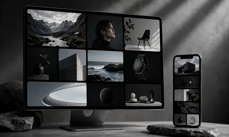
The world of user interface design moves in distinct cycles, shifting from the hyper-skeuomorphism of the early mobile era to the ultra-flat, sterile layouts that followed. In 2026, the prevailing aesthetic strikes a perfect balance: the Bento Grid. Named after the traditional Japanese lunchbox that compartmentalizes different foods into neat, separate boxes, this layout style organizes content into a cohesive grid of asymmetrical, rounded rectangles.
Pioneered heavily by Apple’s product landing pages and popularized by sleek SaaS platforms and developer portfolios, the Bento Grid has taken the web by storm. But this trend is far more than just a passing visual fad for design-forward tech companies. Beyond its sleek, minimalist aesthetic, the Bento Grid is a highly functional, content-first design pattern that solves complex responsive layout challenges when executed with technical precision. It allows developers to present high information density without overwhelming the user.
The Anatomy of a Successful Bento Grid
To build a Bento Grid that works, you must understand the strict spatial rules that separate a chaotic mess from a polished, modern user interface. A successful Bento layout relies on a tight framework of predictable geometry mixed with unpredictable content sizing.
- Hierarchical Cell Spanning: Unlike a standard, uniform photo gallery, a Bento Grid thrives on variance. It leverages CSS Grid properties like grid-column: span 2 or grid-row: span 2 to make high-priority content physically larger than secondary elements.
- Uniform Outer and Inner Geometry: The layout feels cohesive because every cell shares an identical border-radius (typically a soft, modern $16\text{px}$ to $24\text{px}$) and a perfectly consistent gap or gutter (usually $12\text{px}$ to $20\text{px}$).
- Encapsulated Context: Each card or cell acts as its own container ecosystem. The typography, background gradients, and asset placements are completely self-contained.
- Micro-interactions: Because the layout is inherently modular, it responds beautifully to interactive elements. Subtle hover states, smooth scaling transformations, and floating shadows help users understand what elements are interactive.
Real-World Bento Grid Layout Examples & Use Cases
The versatility of the modular grid structure makes it highly adaptable across various web sectors. Here are four practical examples of how the Bento Grid is implemented in modern web design.
A. The Personal Portfolio & Resume Grid
The traditional, linear resume layout can feel dry and fail to capture a creator’s personality. A Bento Grid transforms a personal portfolio into a dynamic, scannable visual narrative.
- The Structure: A large, $2 \times 2$ hero card sits at the top left containing a professional bio and headshot. Flanking it are smaller $1 \times 1$ squares showcasing live stats (e.g., “5+ Years Experience”, “20+ Shipped Projects”). Below, a wide $3 \times 1$ rectangular card acts as a marquee slider displaying core technologies, while an interactive $1 \times 2$ vertical card embeds a live Spotify widget or GitHub activity feed.
- Why It Works: It respects the user’s attention span. A hiring manager can instantly digest the developer’s stack, background, and personality in a single glance without scrolling through endless pages of text.
B. The Product Feature Showcase
Hardware manufacturers and software companies use Bento Grids to display complex technical specifications alongside emotional marketing copy.
- The Structure: A massive centerpiece card displays an interactive 3D model or high-resolution video of the product. Surrounding this anchor card are smaller cells that display individual value propositions: one cell might highlight an “All-Day Battery Life” statistic with massive typography, another features a glowing micro-animation of a custom chip, and a third houses a rotating carousel of customer testimonials.
- Why It Works: It mirrors the physical architecture of complex machinery. By splitting features into distinct visual compartments, the reader can process technical specifications asynchronously without getting bogged down in a wall of prose.
C. The SaaS Analytics Dashboard
Dashboards have historically suffered from clutter, presenting a chaotic spreadsheet feel that causes user cognitive fatigue.
- The Structure: A 4-column master grid serves as the dashboard framework. The leftmost $2 \times 2$ cell displays the main interactive line graph tracking revenue data. To the right, stacked $1 \times 1$ cards display quick-glance metrics like “Active Users” and “Conversion Rate.” The bottom row consists of a wide $3 \times 1$ feed showcasing recent user logs alongside a square $1 \times 1$ shortcut button for quick system actions.
- Why It Works: It establishes an ironclad visual hierarchy. By giving critical telemetry charts double the spatial footprint of static metrics, data analysts can naturally prioritize their operational monitoring.
D. The Digital Magazine & Media Hub
For media companies, balancing breaking news, video content, and mandatory advertisement placements without looking messy is an ongoing struggle.
- The Structure: The “Breaking News” story occupies a dominant horizontal banner across the top. Below, the screen splits into an asymmetrical puzzle: a vertical card holds an embedded video player for a trending documentary, a square block handles a textual opinion piece, and a highly stylized $1 \times 1$ cell serves as a native advertisement slot that blends organically into the aesthetic.
- Why It Works: It breaks the monotony of the standard vertical article stream. The layout feels curated and editorial, keeping readers engaged longer by presenting media in an unexpected, exploratory format.
The Responsive Challenge: How to Scale Bento Grids
While Bento Grids look spectacular on a sprawling $27\text{-inch}$ desktop monitor, translating that complex spatial puzzle to a narrow mobile viewport is a notorious pain point. If you attempt to scale the grid down proportionally, the cells become microscopic and completely unreadable.
CSS
/* Desktop Baseline: 4-Column Asymmetrical Bento Grid */
.bento-container {
display: grid;
grid-template-columns: repeat(4, 1fr);
gap: 16px;
}
/* Mobile Fallback: Linear Stack */
@media (max-width: 768px) {
.bento-container {
grid-template-columns: 1fr;
}
.bento-item {
grid-column: span 1 !important;
grid-row: span 1 !important;
}
}
The most effective responsive strategy is to utilize mobile-first CSS Grid architectures. On mobile viewports ($768\text{px}$ and below), the container should completely collapse into a single-column linear layout (grid-template-columns: 1fr). Any explicit row or column spans are overridden to simply occupy a single track.
As the viewport expands to tablet widths, you can transition into a balanced 2-column layout by reconfiguring the grid track properties. Finally, at desktop viewports, you can safely trigger your full 4-column layout layout with custom grid-row and grid-column span configurations. Additionally, developers can use container queries to dynamically adjust typography and internal padding inside each individual card based on the changing size of its container, ensuring layout integrity across all devices.
The Bento Grid layout is a masterclass in modern visual storytelling. By combining structural rigidity with organic content scaling, it provides web developers with a powerful tool to pack dense, varied information into a clean, extraordinarily engaging user experience.
