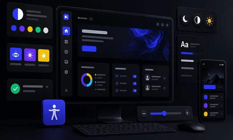
Dark mode is frequently treated as a trendy aesthetic preference, a sleek marketing asset, or a useful layout option to save mobile battery life. However, for millions of users worldwide, a dark interface is not an aesthetic luxury; it is a functional necessity. Individuals with specific visual or neurological conditions—such as severe photophobia (extreme light sensitivity), cataracts, ocular albinism, or traumatic brain injuries—experience physical pain, blurred vision, or immediate cognitive fatigue when navigating traditional bright interfaces.
Unfortunately, many standard dark themes fail foundational web accessibility compliance. Simply swapping a white canvas for a dark one often introduces muddy contrast levels, vibrating neon accents, or a complete loss of structural layout hierarchy when shadows disappear. Building an inclusive dark mode requires implementing adaptive, high-contrast design patterns that blend Web Content Accessibility Guidelines (WCAG) AAA compliance with modern CSS token architectures, ensuring interfaces remain highly readable and comfortable for all users.
The Visual Ergonomics of Dark Mode
Designing an inclusive dark interface requires an understanding of how human eyes process light shapes on dark backgrounds. A primary optical challenge in dark design is an effect known as halation.
Halation occurs when bright text on a dark background appears to bleed or glow outward into the surrounding negative space. This visual bleeding strains the eye’s focus mechanism, and it is drastically amplified for users with astigmatism—a condition affecting roughly $1\text{ in }3$ people. When fine white text sits on a pure black (#000000) background, the extreme contrast creates an aggressive visual vibration that reduces reading comprehension and causes rapid eye strain.
To mitigate halation and reduce eye fatigue, inclusive design tokens avoid high-contrast extremes. Instead of pairing pure black with pure white, accessible design systems use deep, muted dark grays, slate tones, or charcoal foundations (such as #121212 or #1a1a24). These rich, dark bases are then paired with soft, desaturated, off-white typography layers (such as #f5f5f7). This combination retains an exceptional contrast ratio while softening the sharp, glowing edges of the letter glyphs.
Core Architectural Patterns for High-Contrast Dark Mode
To scale a dark theme across an enterprise application, development and design teams must establish strict semantic patterns that adapt systematically to varying layout requirements.
A. Surface Layering & Elevation Signals
In standard light-themed user interfaces, designers communicate spatial depth, stacking order, and component importance using dropped shadows (box-shadow). However, because shadows are physically invisible inside a dark interface, traditional depth signals break down completely.
Inclusive dark modes replace shadow casting with progressive surface illumination. Components closer to the user’s eye line (such as pop-up modals, active dropdown menus, or elevated product cards) must utilize progressively lighter background tint layers. This technique mimics physical lighting: elements floating closer to the light source naturally capture more illumination.
Visual Elevation Stack in Dark Mode:
[ Layer 3: Modal Container ] ───► Lightest Dark Gray (#2d2d3d)
[ Layer 2: Elevated Card Component ] ──► Mid Dark Gray (#1e1e2a)
[ Layer 1: App Canvas Background ] ────► Deepest Base Color (#121212)
B. Desaturating the Palette for AAA Compliance
Migrating a brand’s color palette straight from a light theme into a dark space often breaks color accessibility. Highly saturated brand colors (like a bright royal blue or a vivid crimson) lose their contrast efficacy against dark grays, sinking below the WCAG AA minimum threshold. Conversely, using highly vibrant neon variants to force contrast compliance creates high-luminance hot spots that cause visual discomfort.
Inclusive design systems resolve this by establishing desaturated, pastelled color tokens specifically for dark spaces. Shifting vibrant accent colors toward lighter, calmer shades allows components to easily clear the strict WCAG AAA contrast threshold of $7:1$ for normal body text and $4.5:1$ for heavy headings, without overwhelming the user’s vision.
C. Semantic Iconography & High-Contrast Overrides
Icons inside a dark canvas cannot rely on identical light-mode geometric stroke profiles. Because light glyphs visually expand against dark backgrounds due to the halation effect, fine details inside inline SVG icons can easily fill in or become muddy. Inclusive systems optimize icons by downscaling stroke weights slightly or swapping out solid icon assets for clear, outlined variants.
Furthermore, interface alerts (such as error validation fields) must never convey meaning purely through color shifts (e.g., changing a gray outline to red). High-contrast dark modes always pair a color change with an explicit secondary marker, such as an error icon glyph or a bold structural outline, supporting color-blind individuals.
D. Typography Tuning: Letter-Spacing and Weight Adjustments
Because bright typography visually expands on a dark canvas, standard font configurations often run together. To maintain absolute legibility, design tokens should adjust dynamically when dark mode is toggled:
- Slightly Reduce Font Weights: Drop thin text layers down a single font-weight increment (e.g., shifting body text from font-weight: 500 down to 400).
- Slightly Increase Letter Spacing: Expand character kerning marginally (letter-spacing: 0.02em) to provide each glyph with an insulating air buffer, ensuring adjacent characters do not visually bleed into one another.
Technical Implementation: Modern CSS Custom Properties & System Preferences
An inclusive architecture must respond automatically to browser-level user preferences while providing an explicit, persistent toggle interface override for individuals who require high-contrast dark settings continuously.
The following CSS implementation demonstrates a design token setup that automatically adopts system preferences via media queries, while supporting an explicit data-attribute override (data-theme=”dark-high-contrast”) for advanced accessibility settings:
CSS
/* 1. Baseline Global Design Tokens (Light Theme Default) */
:root {
–color-bg-base: #ffffff;
–color-bg-surface: #f4f4f6;
–color-text-primary: #111115;
–color-accent: #0056b3; /* Saturated blue */
}
/* 2. Automated Media Query for System Dark Preferences */
@media (prefers-color-scheme: dark) {
:root {
–color-bg-base: #121212;
–color-bg-surface: #1e1e1e; /* Elevated surfaces are lighter */
–color-text-primary: #f5f5f7; /* Soft, desaturated off-white */
–color-accent: #8ab4f8; /* Desaturated, accessible pastel blue */
}
}
/* 3. Explicit UI Target Overrides for High Contrast Dark Mode */
[data-theme=”dark-high-contrast”] {
–color-bg-base: #000000; /* Absolute black anchor for low-vision contrast */
–color-bg-surface: #1a1a1a;
–color-text-primary: #ffffff; /* Absolute crisp white text */
–color-accent: #ffff00; /* High-visibility yellow accent */
/* Apply typography ergonomic spacing adaptations globally */
body {
-webkit-font-smoothing: antialiased;
letter-spacing: 0.03em;
font-weight: 400;
}
}
High-contrast dark mode is not a minor stylistic theme variation; it is a vital accessibility pattern that supports diverse human user profiles. By thoughtfully managing surface lighting, desaturating color arrays to clear WCAG AAA guidelines, adjusting font spacing to mitigate visual bleed, and organizing code via semantic CSS tokens, engineering teams can build digital workspaces that are highly readable, comfortable, and inclusive.
