Walk across the modern internet, and you will experience a profound sense of digital déjà vu. Driven by the homogenization of uniform utility frameworks, predictable landing page templates, and safe, focus-grouped corporate design systems, millions of web applications look identical. Soft blue gradients, generic rounded corners, pill-shaped buttons, and vast expanses of empty space dominate the landscape. It is an aesthetic built to avoid offending anyone—but it also fails to excite anyone.
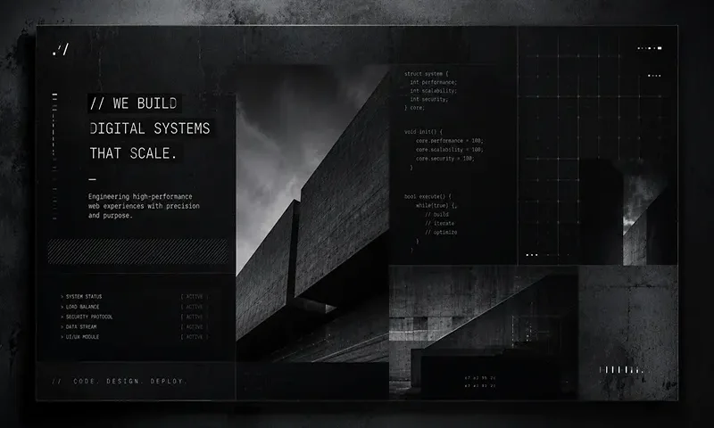
In response to this corporate saturation, a rebellious counter-cultural design movement is sweeping through developer utilities, Web3 infrastructures, indie hacker repositories, and cutting-edge design agencies in 2026. This aesthetic rejects polished artificiality in favor of a raw, uncompromising architectural style: Technical Monospaced Typography paired with Code Brutalism. Far from being an accidental or unfinished mistake, this design philosophy represents an intentional, anti-decorative statement that celebrates engineering truth, structural transparency, and high-performance digital minimalism.
Defining the Pillars of the Aesthetic
To successfully build an interface in this style, a designer must replace the standard rules of web decoration with the structural mechanics of an integrated development environment. It is a philosophy rooted in showing, rather than hiding, the digital scaffolding.
A. Technical Monospaced Typography
In traditional web design, monospaced typefaces are quarantined inside small code snippets. In the Technical Mono aesthetic, they are elevated to the primary visual voice.
- The Desktop Code-Editor Feel: Typefaces like SF Mono, JetBrains Mono, or Fira Code are used for everything from main hero headers to long-form body copy.
- Micro-Labels and Metadata: Layouts make extensive use of tiny, capitalized micro-labels, timestamps, commit hashes, and file size readouts. Typography is no longer just copy; it functions as a structural grid element that mimics terminal data dumps.
- Aesthetic Alignment: Characters occupy the exact same horizontal width, creating a rigid, predictable rhythm that instantly evokes a sense of technical precision and terminal-level control.
B. Code Brutalism & Structural Transparency
Inspired by the mid-century Brutalist architectural movement—which left raw concrete exposed rather than hiding it behind plaster or paint—Code Brutalism lays bare the HTML box model.
- Exposed Grid Frameworks: Instead of hiding layout alignments in invisible margins, Code Brutalism draws attention to them. The interface is bound together by explicit, unyielding, solid $1\text{px}$ or $2\text{px}$ black or white borders.
- Unapologetic Dividers: Table rows, grid gaps, and sidebar boundaries are sharply delineated.
- Raw System Colors: The color scheme deliberately leans into default browser tones, stark monochromes, or high-saturation terminal palettes—think pure #000000 pitch black, #FFFFFF crisp white, classic computer terminal green, or a stinging neon amber.
C. Anti-Design and Radical Contrast
Code Brutalism is fundamentally a rejection of the “polite” web. It actively avoids the visual smoothing techniques that modern design software encourages by default.
- Rejection of Softness: You will find zero soft drop-shadows, zero organic gradients, and zero rounded corners. The border-radius variable is set firmly to 0px.
- Harsh Geometric Layouts: Box elements slam directly against each other. Interaction states do not gracefully fade over a $300\text{ms}$ cubic-bezier transition; they snap instantly on hover with high-contrast color inversions.
- Intentional Visual Friction: The design prioritizes stark geometric clarity over smooth, manicured corporate comfort.
The Functional Benefits: Why It’s More Than Just “Cool”
While critics might dismiss Technical Mono and Code Brutalism as a passing fad for design hipsters or nostalgic engineers, the aesthetic delivers massive, quantitative operational advantages that traditional design systems struggle to match.
- Lightning-Fast Performance: Because the aesthetic strips away heavy asset overhead, its performance profile is unmatched. There are no heavy background images, complex WebGL wrappers, or massive custom font files to download. By relying on system monospaced fonts and basic CSS border properties, these websites achieve near-zero asset footprints. The result is instant DOM painting, perfect Core Web Vitals scores, and lightning-fast loading speeds even on unstable mobile connections.
- High Information Density & Utility: Traditional design paradigms mandate expansive padding and white space, forcing users to scroll endlessly to find relevant data. Code Brutalism rejects this inefficiency. Borrowing its layout density from complex terminal interfaces and IDE dashboards, it allows users to ingest vast amounts of technical data, API specifications, and nested parameters seamlessly. It strips away marketing fluff and places pure, unadulterated information at the center of the user experience.
Real-World Implementations and Inspiration
In 2026, forward-thinking tech companies, developer platforms, and portfolio sites are adopting this aesthetic to signal authenticity and engineering authority to their audiences.
Instead of a generic lifestyle stock photo, a modern developer tools platform landing page might present a giant, interactive mock terminal window. The hero text is styled as a system log readout, with terminal syntax highlighting pointing directly to the product’s core features.
Engineering blogs built in this style eschew complex content management systems for minimalist layouts where raw markdown files are rendered between strict grid lines. Instead of relying on heavy graphic illustrations, these sites utilize creative ASCII art banners to add personality. Portfolio sites treat code comments (// like this) as primary copywriting elements, turning the interface into a living, breathing extension of a developer’s codebase. It is an aesthetic that communicates directly to the builder community, bypassing marketing spin entirely.
The fusion of Code Brutalism and Technical Mono offers a much-needed breath of fresh air in an internet cluttered with homogenized, cookie-cutter layouts. By trading corporate politeness for authentic engineering power, this aesthetic demonstrates that an interface can be stark, high-contrast, and geometric while remaining exceptionally usable and blindingly fast. It honors the core medium of the web—raw code and structural layout—rather than trying to mask it.
