In today’s digital age, having a strong online presence is crucial for local law firms aiming to attract and retain clients. A website that is both visually appealing and user-friendly can significantly enhance a law firm’s reputation and reach. Responsive web design (RWD) is an essential component in creating such an effective website. It ensures that your site looks great and functions flawlessly across all devices, including desktops, tablets, and smartphones. Here are some practical responsive web design tips for improving local law firm websites:
1. Prioritize Mobile-First Design
Many potential clients search for legal services on their smartphones. Designing your website with a mobile-first approach means creating an optimal experience for smaller screens before scaling up to larger devices. This strategy helps streamline content, load times, and navigation, ensuring users can easily find important information like practice areas, contact details, and attorney profiles on any device.
2. Simplify Navigation for Smaller Screens
Local law firm websites often contain a lot of important information. In a responsive design, it’s critical to simplify navigation menus on smaller screens. Implement hamburger menus or collapsible navigation bars to provide a clean and uncluttered browsing experience. Make sure the menu items are clearly labeled and easy to tap to reduce frustration and keep users engaged.
3. Optimize Page Load Speed
Slow-loading websites can drive visitors away, impacting client inquiries and search engine rankings. Use optimized images, leverage browser caching, and minimize code to speed up your site. Responsive design techniques that reduce unnecessary elements on mobile versions help your site load faster, providing a seamless user experience that encourages visitors to stay longer and explore your services.
4. Use Readable Fonts and Clear Calls to Action
Text readability on all screen sizes is critical for conveying professionalism and trustworthiness. Choose clean, legible fonts with appropriate sizes, especially for mobile devices where screen space is limited. Additionally, incorporate clear and concise calls to action (CTAs) such as “Schedule a Consultation” or “Call Now” buttons that are easy to see and tap, guiding potential clients toward contacting your firm.
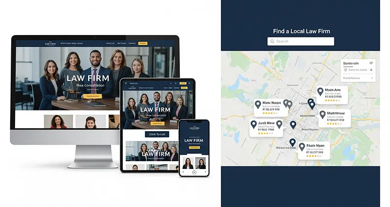
5. Implement Location-Based Features
For local law firms, integrating location-based features like interactive maps, clickable phone numbers, and local SEO elements can enhance user experience and improve local search visibility. Responsive design ensures these features function properly regardless of device type, helping clients quickly find and connect with your firm.
6. Test Across Multiple Devices and Browsers
To ensure a truly responsive law firm website, regularly test its appearance and functionality across a range of devices and web browsers. Testing helps identify layout issues, broken links, or navigation problems that could deter users. Tools like Google’s Mobile-Friendly Test and BrowserStack can aid in comprehensive cross-platform testing.
7. Highlight Client Testimonials and Case Results
Showcasing client testimonials, reviews, or successful case outcomes in a responsive manner builds credibility and trust. Design these elements to adjust fluidly to different screen sizes, ensuring potential clients can easily read and be influenced by positive feedback no matter what device they use.
By implementing these responsive web design tips, local law firms can create websites that not only attract but also retain clients through a seamless and professional online experience. A responsive, user-centric website signals to potential clients that your firm is modern, approachable, and ready to meet their legal needs—anytime, anywhere. Investing time and resources into responsive design is a smart strategy for any law firm looking to grow its local presence and thrive in a competitive market.
