Digital accessibility is not an optional feature or a post-production polishing step; it is a fundamental human right. When a digital interface lacks sufficient visual distinction, millions of users with low vision, color blindness, cataracts, or situational impairments (such as screen glare in direct sunlight) are completely locked out of the experience.
As global regulatory landscapes tighten, digital accessibility engineering has transformed into a strict legal requirement. Frameworks like the Americans with Disabilities Act (ADA) in the United States, the European Accessibility Act (EAA) across the EU, and Section 508 for government procurement anchor their visual requirements directly to codified metrics. Integrating an automated contrast ratio checker into the design-to-development pipeline is the only definitive way to eliminate visual barriers, ensure legal compliance, and craft user interfaces that are legible to everyone.
The Mathematical Physics of Color: Luminance and Contrast
Many designers and frontend developers mistakenly assume that color contrast is a subjective visual judgment. In the context of web accessibility compliance, however, contrast is governed by a precise mathematical model based on human optical physics.
To calculate the contrast ratio between a text string and its background, you cannot simply look at raw RGB hex codes. The browser must first calculate the Relative Luminance ($Y$) of each color. Relative luminance represents the perceived brightness of a color relative to an absolute white point. Because the human eye is unequally sensitive to different wavelengths of light—perceiving green much brighter than red, and red much brighter than blue—the raw RGB channels must be normalized, linearized to undo the display’s non-linear gamma correction curve, and heavily weighted using the standard WCAG coefficient formula:
$$Y = 0.2126 \times R_{\text{linear}} + 0.7152 \times G_{\text{linear}} + 0.0722 \times B_{\text{linear}}$$
Once the relative luminance value is extracted for both the foreground and background color spaces, the official WCAG contrast ratio ($CR$) is computed using the following formula:
$$CR = \frac{L_1 + 0.05}{L_2 + 0.05}$$
In this formula, $L_1$ represents the relative luminance of the lighter color, and $L_2$ represents the relative luminance of the darker color. The constant offset of $+ 0.05$ is factored into both sides of the ratio to account for ambient light adaptation and screen reflections, ensuring the math holds true even in real-world viewing conditions. The resulting value scales precisely from $1:1$ (absolute zero contrast, such as white text on a white background) up to $21:1$ (maximum possible contrast, achieved exclusively by pure black text on a pure white background).
Decoding WCAG Compliance Thresholds
The Web Content Accessibility Guidelines (WCAG) break down visual compliance into strict tiered thresholds depending on the target standard (AA or AAA) and the physical size of the typography layout.
WCAG AA Requirements (The Industry Baseline)
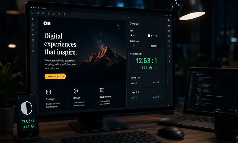
- Normal Text: Standard body text smaller than $18\text{pt}$ (roughly $24\text{px}$) regular, or smaller than $14\text{pt}$ (roughly $18.66\text{px}$) bold, must maintain a minimum contrast ratio of $4.5:1$.
- Large Text: Text that is at least $18\text{pt}$ regular or $14\text{pt}$ bold requires less contrast because larger glyph structures are inherently easier for the eye to isolate; it must hit a minimum threshold of $3:1$.
- User Interface Components: Functional non-text elements, such as form input borders, button outlines, and active state icons, must maintain a minimum contrast ratio of $3:1$ against their adjacent backgrounds.
WCAG AAA Requirements (The Gold Standard)
- Normal Text: Enhanced readability standards demand a strict contrast ratio threshold of $7:1$.
- Large Text: Large scale headings under AAA compliance must achieve a minimum contrast ratio of $4.5:1$.
As the web typography landscape evolves, the upcoming WCAG 3.0 guidelines are transitioning toward a new model known as the Advanced Perceptual Contrast Algorithm (APCA). Unlike legacy WCAG 2.x math, which evaluates colors in isolation, APCA is a context-dependent algorithm that calculates contrast based on text size, font weight, background luminance, and spatial frequency simultaneously, mimicking the human visual system with far greater fidelity.
Core Architectural Features of a Production-Grade Contrast Checker
A basic contrast checker simply compares two flat hex codes. An enterprise-grade accessibility engine requires deep analytical logic to handle the complex realities of modern CSS layouts.
A. Real-Time Alpha Channel & Opacity Blending
Modern interfaces rely heavily on semi-transparent background colors (rgba, hsla) or layered element opacities. When a foreground text element sits on top of a translucent overlay, a naive contrast checker fails because it cannot read alpha channels.
A production-grade checker implements a mathematical process known as alpha compositing (color flattening). The engine calculates how the transparent foreground layers blend into the solid background stack beneath them, computing the true, flat RGB output before executing the relative luminance math.
B. Intelligent Color Suggestion Engine
When a color pairing fails a compliance check during design or development, telling the team that the selection failed is only half the solution.
[ Failed Contrast Check ] ──► [ Analyze HSL Coordinates ]
│
▼ Shift Lightness Axis (L)
[ Compliant Color Output ] ◄─── [ Stop at WCAG Target (4.5:1 / 7:1) ]
An advanced checker reads the failed color data, converts the coordinates into Hue-Saturation-Lightness (HSL) space, and programmatically shifts the lightness variable up or down until it intersects with the exact mathematical boundary required to clear the $4.5:1$ or $7:1$ target. It then suggests the closest compliant color asset while preserving original brand saturation and hue integrity.
C. Automated DOM Tree Eye-Tracking
Enterprise automated checking utilities parse computed styles directly from a browser’s active Document Object Model (DOM). These tools evaluate text contrast in place, checking for complex edge cases like text overlaid on multi-colored CSS gradients, static background images, or pseudo-elements (::before / ::after). The engine samples pixel clusters surrounding the text boundaries to verify that accessibility thresholds are maintained across the entire surface layout.
Practical JavaScript Blueprint: Relative Luminance Engine
The following native JavaScript implementation demonstrates how a testing engine extracts individual RGB channels from a standard hex string, applies non-linear gamma normalization, and returns the precise relative luminance value needed for a contrast check loop.
JavaScript
/**
* Calculates the relative luminance of a standard hex color string.
* Supports 6-digit hex formats (e.g., “#007acc”).
* @param {string} hex – The color string to analyze.
* @returns {number} The relative luminance value between 0.0 and 1.0.
*/
function calculateRelativeLuminance(hex) {
// Sanitize the input string and strip the leading hash symbol
const cleanHex = hex.replace(/^#/, ”);
// Extract integer values from individual RGB channels
const r = parseInt(cleanHex.substring(0, 2), 16) / 255;
const g = parseInt(cleanHex.substring(2, 4), 16) / 255;
const b = parseInt(cleanHex.substring(4, 6), 16) / 255;
// Convert sRGB channels to linear RGB via non-linear gamma expansion
const transformChannel = (val) => {
return val <= 0.04045
? val / 12.92
: Math.pow((val + 0.055) / 1.055, 2.4);
};
const rLinear = transformChannel(r);
const gLinear = transformChannel(g);
const bLinear = transformChannel(b);
// Return weighted luminance based on spectral human visual sensitivity
return 0.2126 * rLinear + 0.7152 * gLinear + 0.0722 * bLinear;
}
Digital accessibility should never be treated as a manual, retroactive checklist or an audit metric to worry about only after receiving a compliance warning. By understanding the underlying physics of color luminance and automating contrast ratio checkers directly within UI/UX design libraries and continuous delivery pipelines, frontend engineering teams can eliminate legibility barriers from day one.
